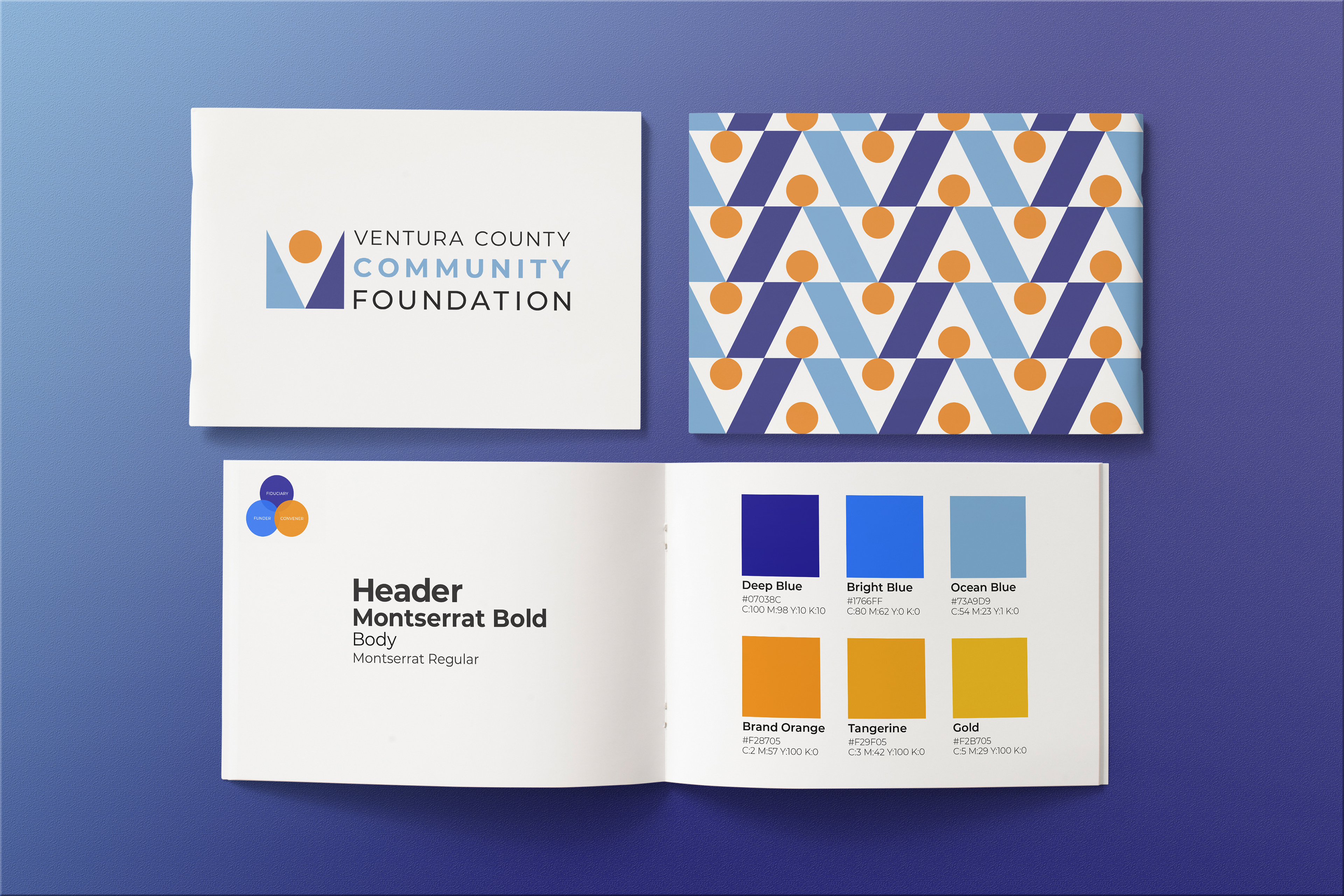
working parallel to staff, board members, and long-time donors to strategically rebrand the foundation, i was tasked with creating a new visual identity to encapsulate the updated mission, vision, and values of VCCF. going for a simple and modern identity, i landed on the design system shown below.
to quote whoever writes VCCF's pr blog: "The composition of triangles and the center circle evokes images of the sun sitting between what can be interpreted as waves, mountain ranges, hills — drawing inspiration from our local geography. The shapes also work well together to abstractly represent the shape of a person celebrating, giving, and/or receiving. The open and expansive quality reflects the broad range of Ventura County. Further, the deep V shape serves as a container and conveys a sense of the community being within. Lastly, the colors create a dynamic quality to the logo — moving from left to right, from light to dark, there is a sense of time passing as if from day to night, and back again. This is representative of the everlasting commitment of the foundation; we are here to stay forever, regardless of the passing of time..." how neat is that?
to quote whoever writes VCCF's pr blog: "The composition of triangles and the center circle evokes images of the sun sitting between what can be interpreted as waves, mountain ranges, hills — drawing inspiration from our local geography. The shapes also work well together to abstractly represent the shape of a person celebrating, giving, and/or receiving. The open and expansive quality reflects the broad range of Ventura County. Further, the deep V shape serves as a container and conveys a sense of the community being within. Lastly, the colors create a dynamic quality to the logo — moving from left to right, from light to dark, there is a sense of time passing as if from day to night, and back again. This is representative of the everlasting commitment of the foundation; we are here to stay forever, regardless of the passing of time..." how neat is that?