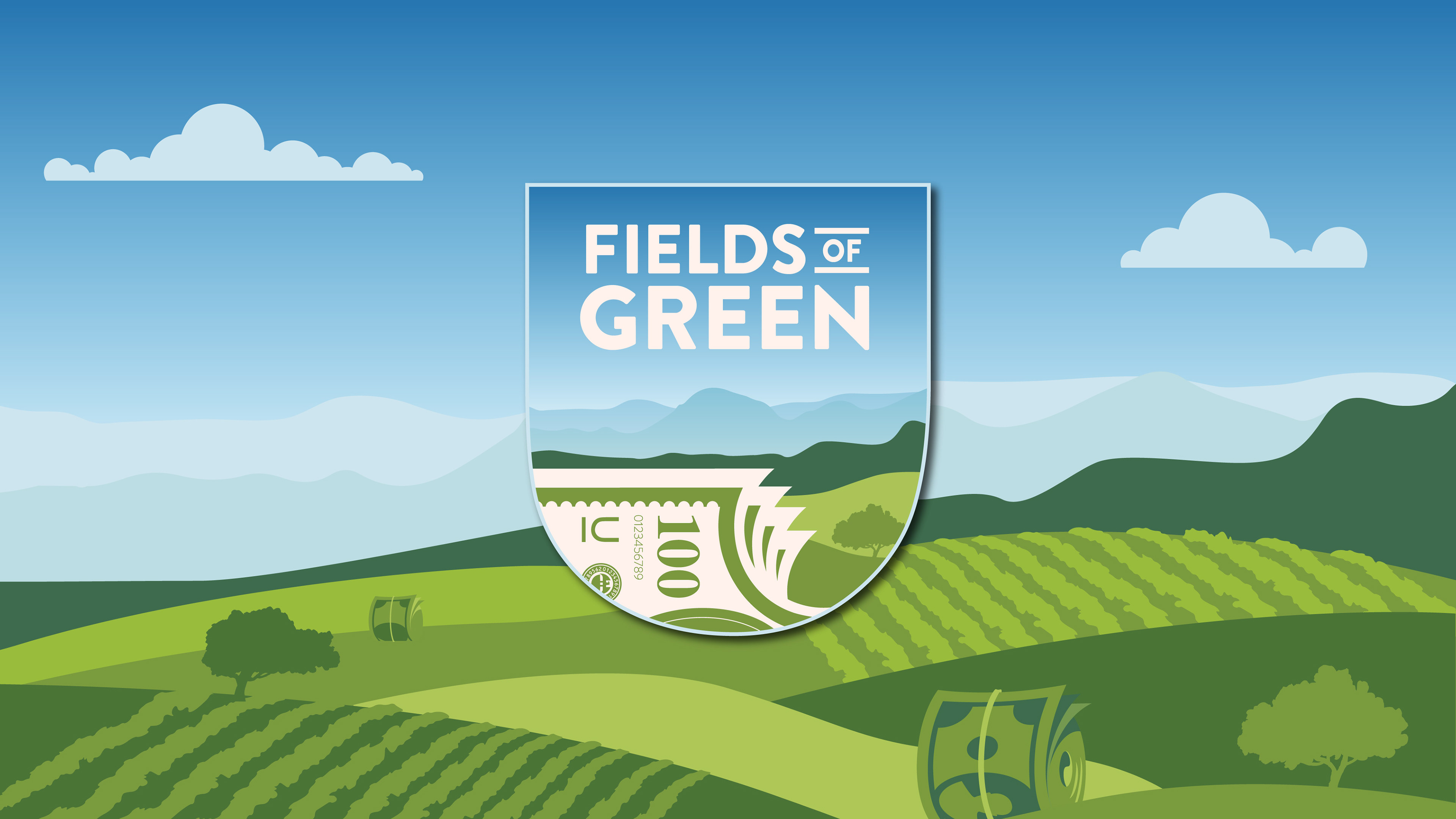
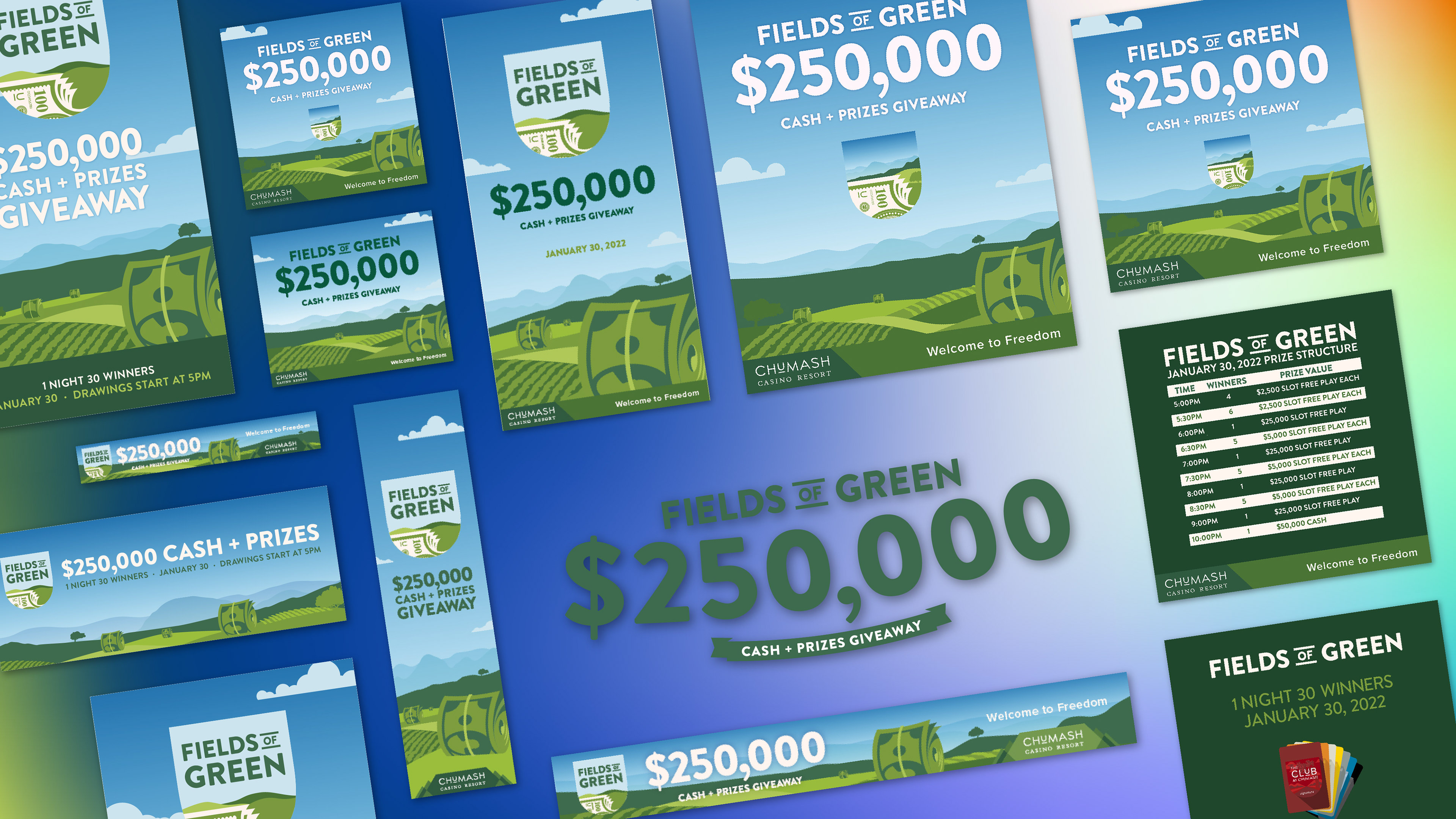
naturally, for a three-month-long promotion, we needed a variety of advertising touchpoints. Below is a selection of a few of the 100-plus print, web, social, environmental, out-of-home, etc. assets created for the campaign. you may note imagery of the Santa Ynez Valley lush with bountiful money rolling like hay bales - more on that in a minute...
alright, here are the 'money' shots. a few photos displaying our rendition of the valley with hay bale-esque cash rolls alluding to the region's - and the promotion's - beauty and bounty. this promotional installation served to both inform the campaign's art direction and to welcome casino goers. encouraging them to dream up what freedoms a world where money grows on trees would afford them. pretty neat if you ask me.
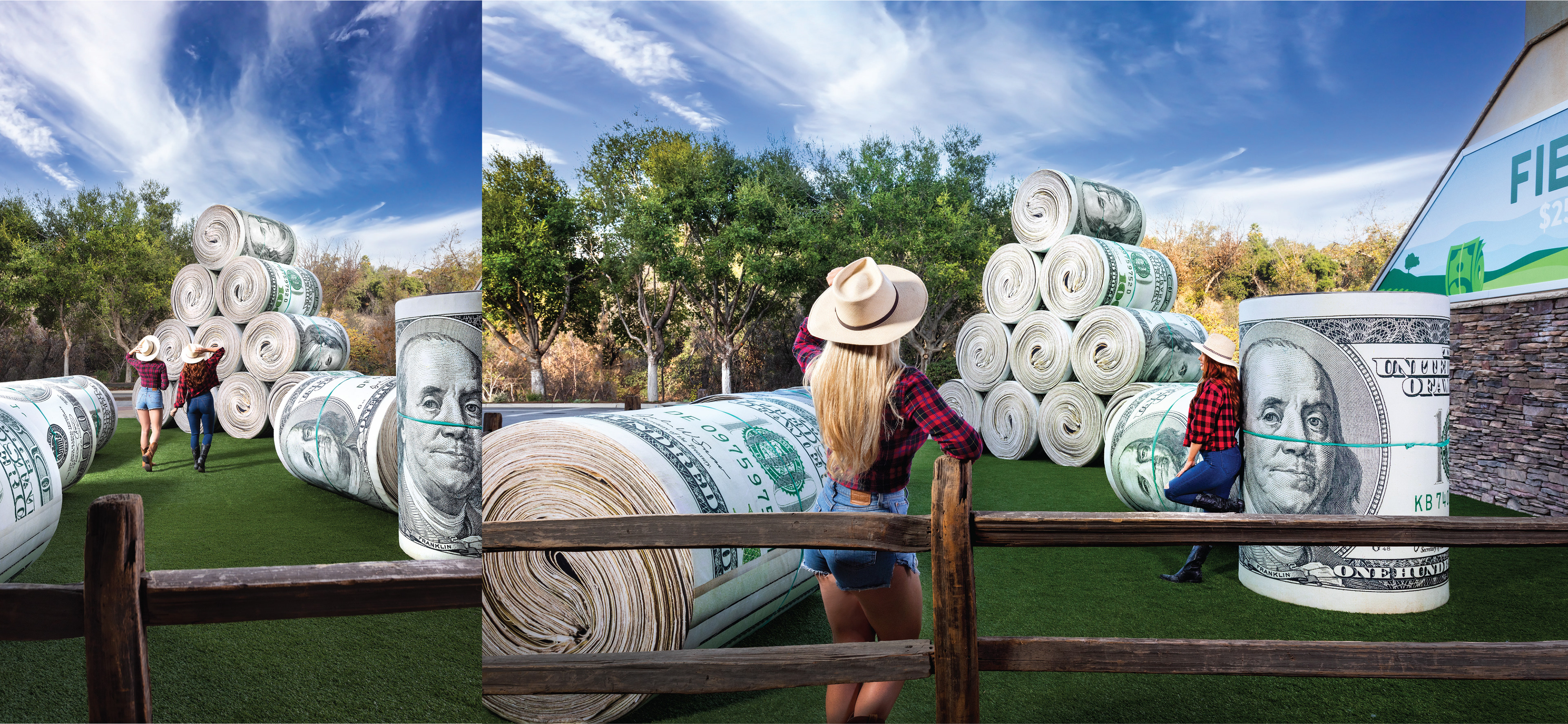
...so how did we get our hands on a few dozen colossal cash rolls? so glad you asked. we - Nils Thyrring and i - designed and built them. very neat, indeed. starting with more-than-a-few sketches, calculations, mock-ups, and models, we landed on two sizes of cylindrical cash rolls - 6' x 4' and 4' x 2.5'
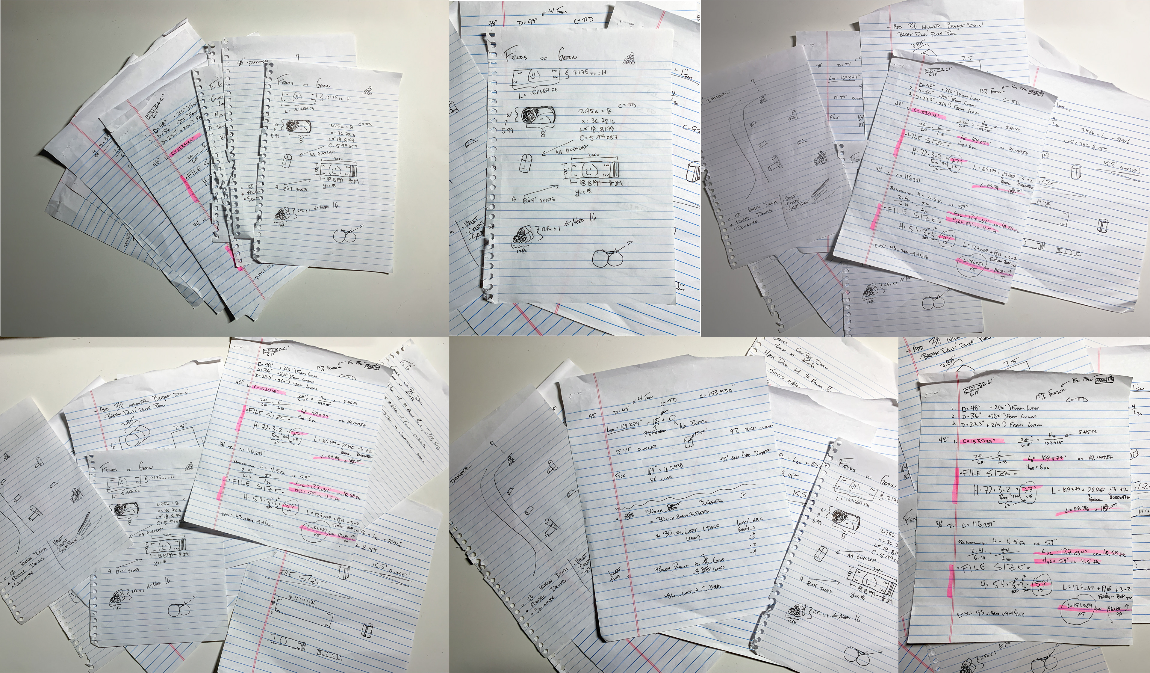
↑ said sketches and calculations ↑
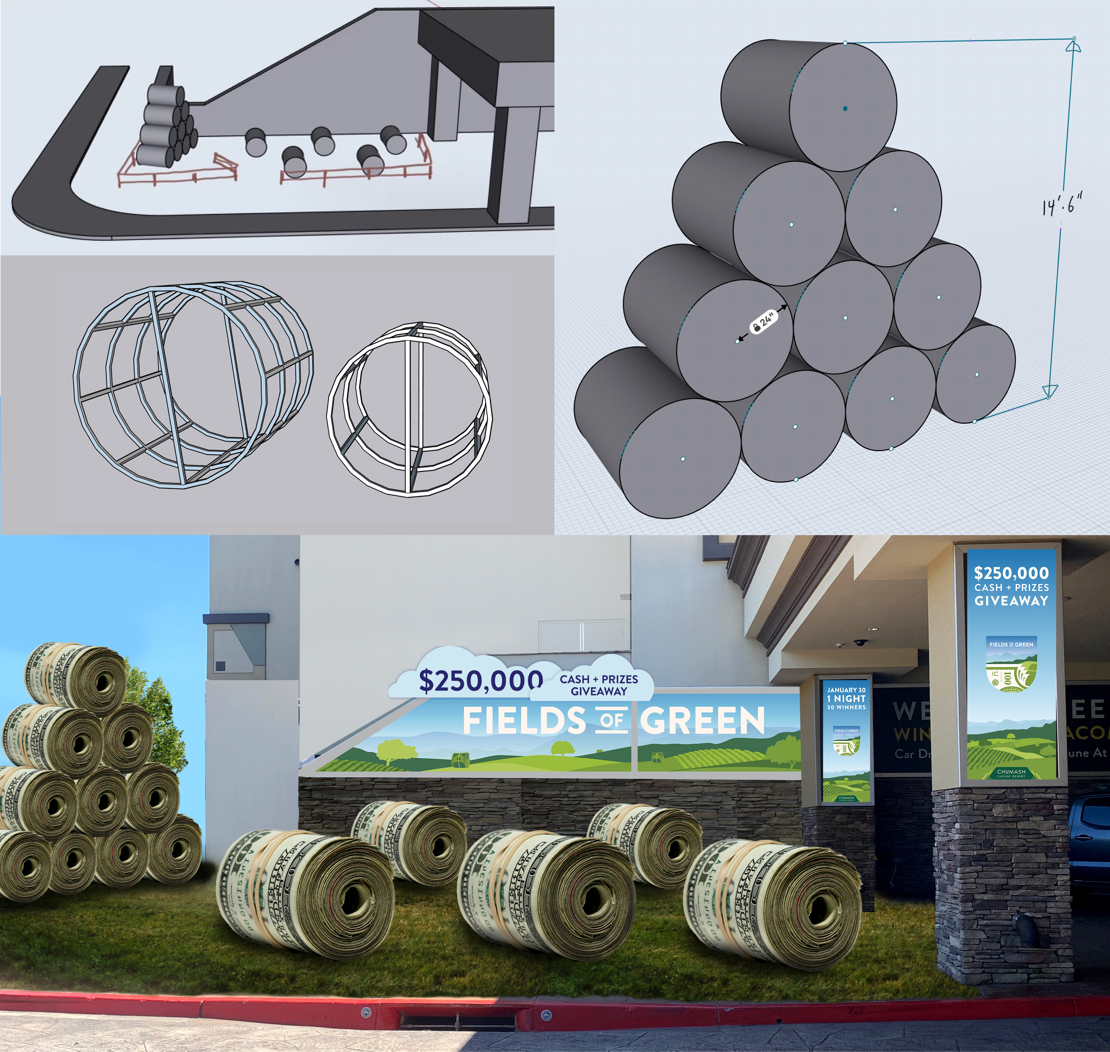
↓ aforementioned models and mock-ups ↓
↓ aforementioned models and mock-ups ↓
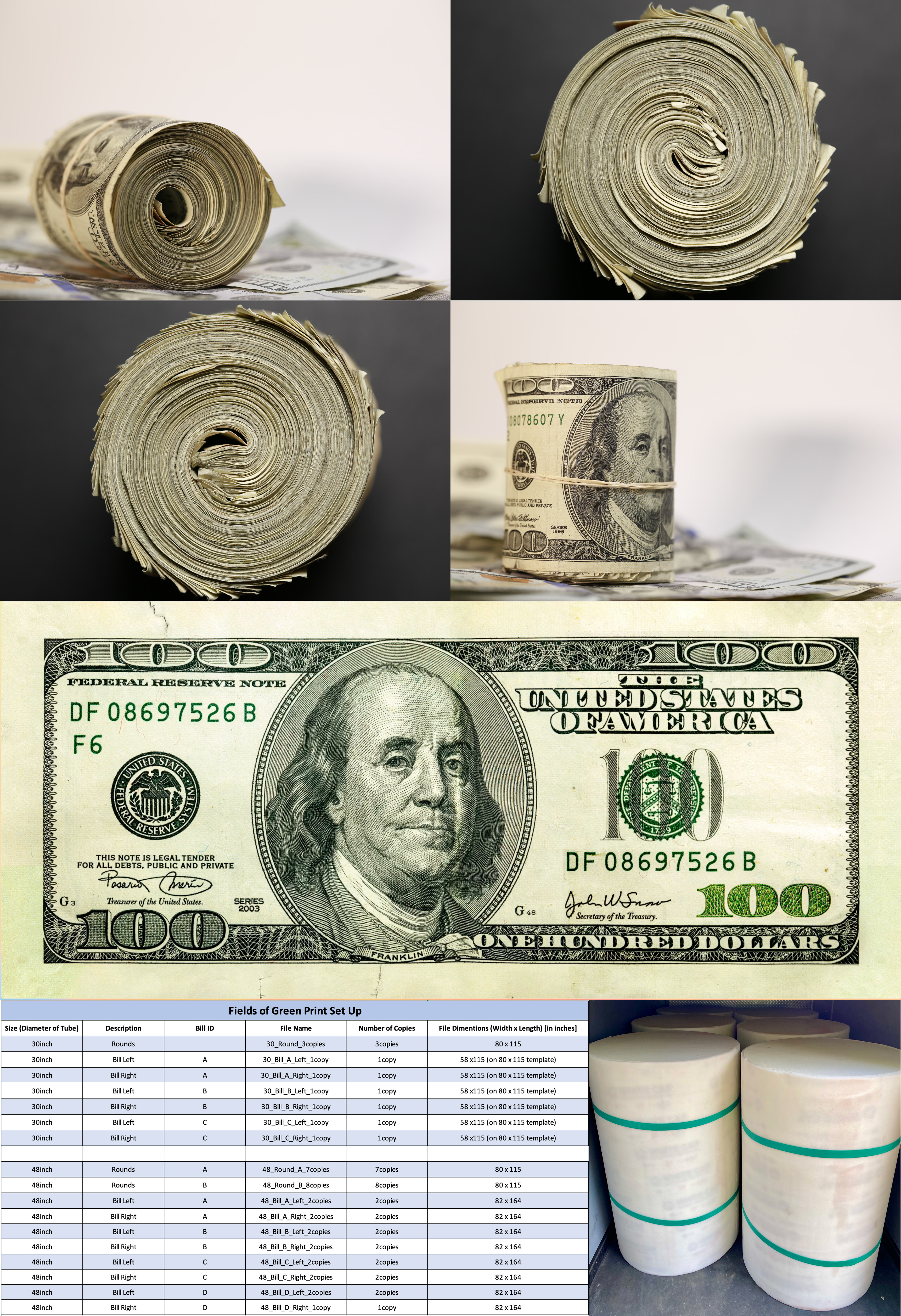
i like to split the construction of the bills into two categories: the 'wraps' and the 'cores'.
the wraps: for those unfamiliar, it is frowned upon to reproduce and print your own replica currency. so frowned upon is this pursuit that Adobe will not allow one to so much as bring an image of money into their software. to skirt this, I photographed four individual bills in left and right halves and stitched each one together in Photoshop to create the images of four unique full notes. combining these images with photos of the top of the rolls, we produced a variety of unique yet photorealistic hundred-dollar bills, with bleed added for our printer. the full images were then printed on a poly-coated canvas material - selected for its water-proof nature and its tactile similarity to the paper blend of American currency.
the cores: in an effort to use recycled materials, we opted to use 48" diameter sonotube, reinforced with concentric ribs - made of two layers of ¾" cabinet grade plywood - held in place with pine firing strips, epoxy, and screws. subsequently, the tubular shells were covered with ½" of medium-density upholstery foam and capped with a disc of birch ply (also treated with a pillow of ½" medium-density upholstery foam). once the cores were fabricated, the wraps were handstitched around them, completing the pre-production phase.
some of these images are shown below, in addition to a breakdown of the print order.
once Nils had finished fabricating the cash rolls, he brought them on property - along with a three-person crew - to start the one-day installation, setting the scene with turf, grasses, split rail fence, and CNC-routed-hand-painted signage.
penultimately, all exterior entry doors were covered with vinyl decals and sintra signage, to provide details and build excitement for guests upon arrival.

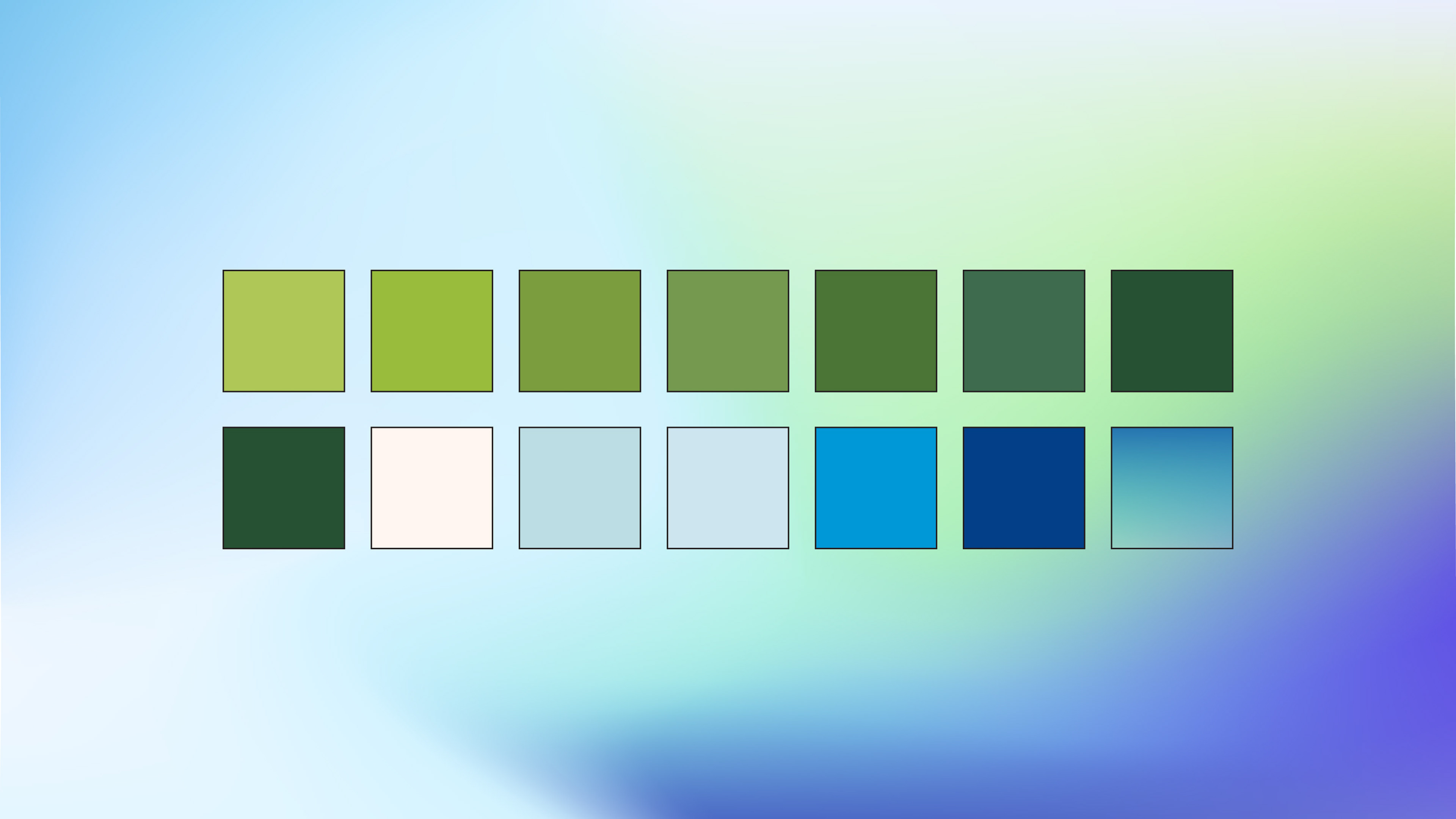
lastly, we see the color palette created for the campaign. Greens and blues pulled from the surrounding fields and skies of Santa Ynez, paired with the creams and greens found on American currency. nothing too revolutionary here, but I thought it was a pretty image to say farewell on. hey, thanks for lookin'.